Can you judge a book by its cover?

Everybody says to never judge a book by its cover, you’ve probably said this yourself at some point, but let’s face it, we all do it anyway. We’ve all judge another person based on the clothes they were wearing or the car they were driving, or on a more light-hearted note, been tricked into watching a crappy B-list movie because it had a cool poster. The point is, whether consciously or unconsciously, we make judgements based on visual impression so often we barely even realized we’re doing it. So I guess what I’m really asking is, are we wrong for doing it? Of course we can judge a book by its cover, but should we?
(That intro got a little more philosophical than intended, but hey, it made you think)
Now when I say “judge a book by its cover”, I don’t mean it in a figurative life lesson kind of way, I mean it in the most literal sense: judging a piece of literature by the artwork on the front. Can it be done?
Short answer: Yes. Absolutely. Anyone who says otherwise either hasn’t browsed enough books or has never worked at a book store.
Long answer:
The Value of Face-Value
Pointing out the obvious, the better the book, the more likely it is to get picked up by a traditional publisher. This in turn gives it access to artwork that an independent author may not have the right to use otherwise, as well as being able to pay professional artists to create entirely original artwork, leaving us with the notion of: better the cover, better the book.
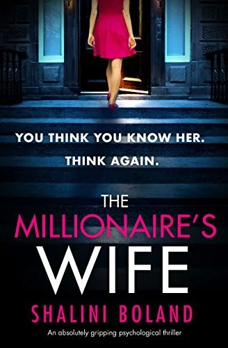
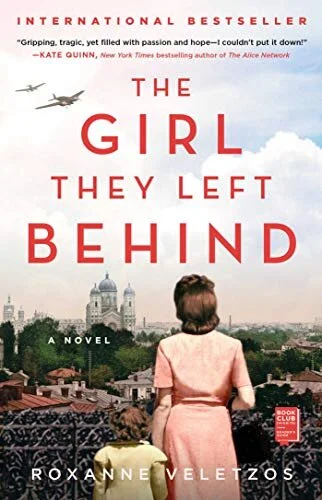
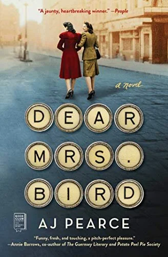
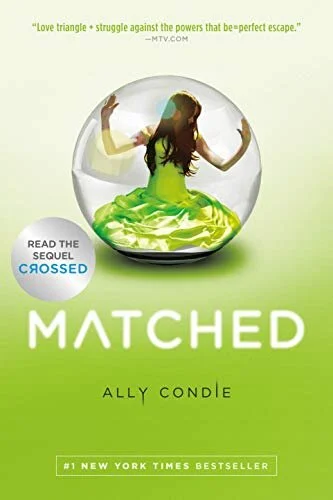
This artwork can then give a certain amount of insight as to what kind of book it is. You see a spaceship, it’s probably science fiction; you see a smiling couple being intimate, it’s probably romance; you see a person with a gun running from an explosion, it’s probably action; you get it. It won’t tell you if you’re going to like it or not, but it can give you a good idea as to what kind of book you’re getting into. This insight especially extends to the title as well, giving you a straight up description of what the book is about in an average of 1 to 7 words.
As an interesting side-note, Hollywood has actually used this tendency of judging something at face-value to their advantage in order to prevent potential leaks, often disguising high-profile film and television scripts as boring academic research papers in order to discourage people from reading them.
But let’s go in the opposite direction, what if there was no cover art? What if the cover had been stripped and upon looking at the book you were immediately reading the text? It’s said that a picture is worth a thousand words, well a thousand words in an average paperback book equals about 4 pages. So could you judge an entire book based on the first 4 pages? Honestly, with authors these days trying to set the tone and hook you from the very beginning… probably.
Trendsetting
Lastly, I just want to point out some of the trends within genres when it comes to the cover art, making it extremely easy to determine a book’s genre just by looking at the cover. See for yourself:


